

.jpg)


Erik Bulatov
«It has always been my conviction that the social space is limited, and the path to freedom leads through the artistic space, which is outside of social space. Of course I realize that this is not a universal path to freedom; but for me it was always the only possible one.
The possibility of expressing this very independence, this distinction between the artists space and the social space, and at the same time the limits of the power of the social space, offered itself directly in the picture I was working on at that time.
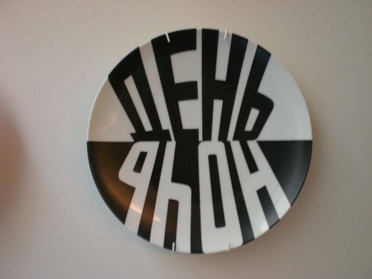
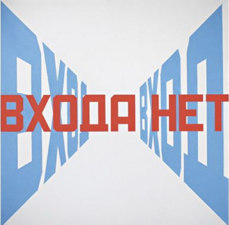
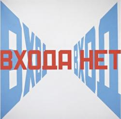
That is exactly what I tried to do in Entrance-no Entrance which I began in 1973 and did not complete until 1975.
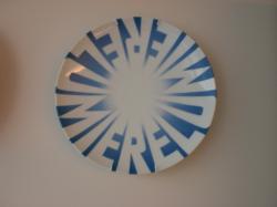
The red letters “VKHODA NET” (“NO ENTRANCE”), cancel out the word “VKHOD” (“ENTRANCE”) which is inscribed on each side and recedes systematically into the depth of the picture. At first sight, it is not a picture at all but some kind of absurd proclamation of a apparently ironic nature. But it is a good idea to take a closer look at it nevertheless.
The word “VKHOD” is clearly expressive of space, and, be receding into the depth of the picture via perspective foreshortening, plastically demonstrates the reality of the space. The words “VKHODA NET”, which represent the plane surface, plastically demonstrate the reality of this plane and thus declare the space non-existent as it were.
At the same time, both letterings have a clear-cut social import.
The red letters bar us from entering. Entering what? A space that is on the other side of the surface of the picture, behind the picture, so to speak. However, by indicating the boundary that we are not allowed to cross, this text, also automatically demonstrates the limits of its own possibilities. The surface of the picture is , after all, also the limits of its own power. The space on this side of the boundary does not belong to it. That is to say, the surface functions as boundary of the social space here.
As far as the victory of red over blue is concerned, this should apparently not be considered unconditional. After all, the letters “DA” (“YES”) stand in the centre of the red line – precisely where the perspective lines of the blue letters meet behind them, the point of their maximum depth. In addition, the “DA-NET” (“YES-NO”) combination gives the prohibition a certain contradictoriness, casts doubt on it», - Erik Bulatov: “Freedom is Freedom”, Kerber Verlag, 2007.
REFERENCES: Part â„– 2
«In “Entrance- No Entrance” the visual effect is created only by the connection between the letters and background. This work was also decisive in shaping the artists’ ideas, as it forced him to solve the problem of space and flatness. The text prohibiting entrance is written in red Cyrillic letters on a flat tangible space. It is truly impossible to enter the picture. There is faint hint of Soviet reality and the prevalence of bans. The use of red in painting runs contrary to the effect of depth, and is therefore a foe of space. We get the impression that these prohibiting words are coming toward us of out the canvas. The double fence of blue letters along the edges of this picture, on contrary, invites the viewer to come into the while void of the canvas. Blue has always helped create depth. White is neutral. It can be either space or flatness. The final meaning of the phrase “No Entrance” is that entrance is prohibited, yet it is placed I n such a way that the end of the first word (“da” or yes) appears in the centre of the composition, which is completely contradicts the prohibitory phrase. Free will , wishes and dreams are set in opposition to the omnipresent ban», - B. Lorquin (Erik Bulatov, Moscow, 2006).
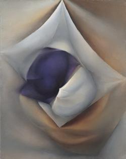
In 1963, Erik Bulatov began signing his works. This was the beginning of the independent artistic career that followed the period when he mastered the experience he had gained from Robert Falk and Vladimir Favorsky. In his paintings from the early sixties, among which is Three Surfaces, Bulatov investigated the surface of objects on the picture plane. For him the picture was not only a visual medium but also a “living organism,” in dialogue with which he could grasp the reality around him. At this time, Bulatov perceived the world as “an infinite number of surfaces”. He discovered that any object consists of surfaces that succeed one another. “Exposing one surface, we always encounter another surface, but something compels us to see what is behind each of them, as if the cause for the existence of these surfaces is concealed within them.” For Bulatov, even the sky was imagined as a dome, a vault – that is, as the surface of something.
In Three Surfaces, several shapes are superimposed on each other and move towards us. In the geometrical center of the abstract composition we discern two shapes, one white and one purple, placed on top of another white, unevenly rectangular shape. Three points of this rectangular shape touch the edges of the painting, while the ocher background, on which all three shapes are placed, extends beyond the picture on all four sides. The colors are applied in chiaroscuro so as to suggest areas of shadow and light, thus creating an illusion of volume and three-dimensionality. We are therefore inclined to read the composition as a still-life. The objects depicted are, in fact, several sheets of paper, that are partially crumbled, pleated or spread out flat. In order to be able to concentrate on the representation of relatively flat surfaces, rather than of deep, receding space, the artist chose to represent his subject matter viewed directly from above, as opposed to from the side.
We get the impression these sheets of paper have a life of their own: that they are set in motion by something within them. But the cause of this motion is incomprehensible and invisible to us because it lies underneath the surface. We see only the relationships of surfaces that arise as the result of these invisible processes. The metamorphosis that occurs in Three Surfaces could happen to any object if we stare long enough at it, singling it out from the mass of other objects. Fixing our gaze on any ne of them, we impart to it a particular, individual character, while everything else becomes secondary. In the same way, we single out the white and purple shapes from the ocher background, differentiating them from everything else around them. The background itself, although it is a vibrating surface, rather dissolves under the swelling surfaces of the sheets of paper, which first and foremost are objects with a surface that distinguishes them from the infinite space around them. At the same time, they have their own volume, which likewise contains fragments of space.
Already in this painting we see evidence of Bulatov’s meditation on space, which were subsequently to become one of the main elements in his works. In this painting, however, space is manifested in connection with the need to investigate the surface. It turns out that the surface needs space in order to avoid remaining a lifeless plane. Thus, in the painting, two-dimensional planes are converted into a three-dimensional image. The illusion of space generates a relief that moves towards us: the image is not directed into the interior of pictorial space; instead, it turns outward and towards the viewer, trying to break away from the plane.
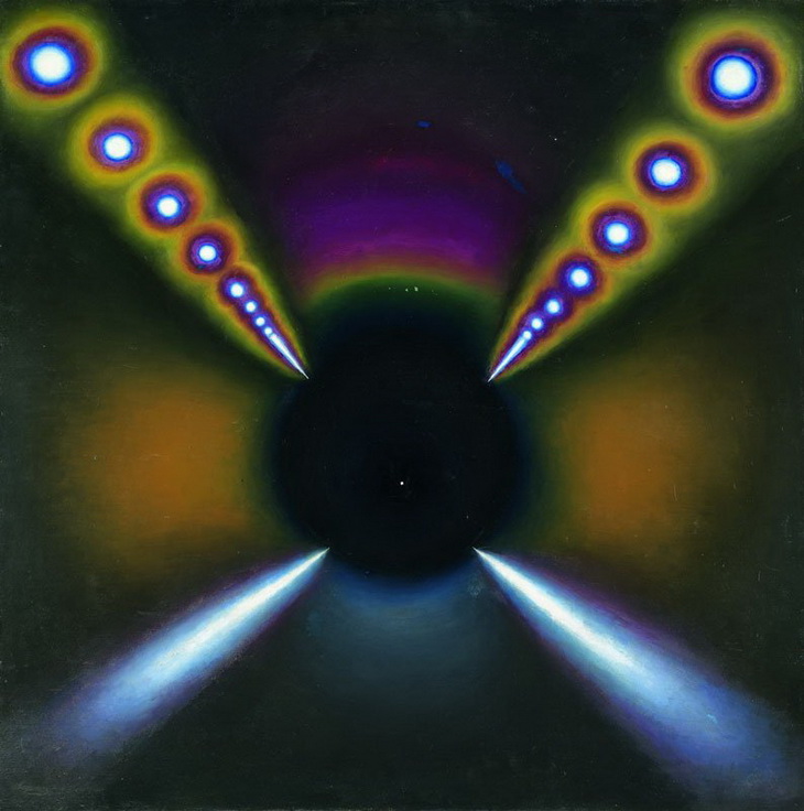
The relation of object to space that Bulatov investigates in this picture is conditioned by the very process of the object’s emergence. During the period when he worked on Three Surfaces, he attempted to explain, in the article “The Beginning” (1963-64), the basic artistic tasks he had set himself: “The object’s birth in space is an event extended in time. I try to make a reverse journey in time, to figure out how the object emerges, to get back to the initial impulse that set space into motion.” For Bulatov, this impulse is the energy of light, whose source can be either the object depicted in the painting or something out of sight. But in either case it is the main cause of the object’s appearance on the picture plane. The energy of this light is concentrated in the picture’s center. It almost appears as if an inward light is emanating from the objects, a light that Bulatov captured in a variety of subtle shades in order to give life to these objects.
Alla Chernetska





.jpg)
